
Reimagining Modern Healthcare

Easily accessible, efficient, affordable, and compassionate. Intellicare care about your health first and foremost, and it shows: the Intellicare brand of healthcare is trusted by over 1,000,000 members and 43,500 affiliated doctors and specialists nationwide.

Role:
UI/UX Designer
Timeline:
2 weeks
Tools:
Figma
This project started out as a simple rebrand, when a few colleagues reached out to me. However, after seeing the navigation issues in the website I took it as a UI/UX challenge and tried to solve the problems users,clients, and the business was encountering.
Current Intellicare Design


A simple
re-branding
Intellicare's initial design is lacking in a lot balance. The lime green is used everywhere but there are colors that doesn't match well with the other secondary colors. The use of photos are also a bit random and sometimes out of place.
Something also needs to be done with the typography and the general direction and hierarchy of information throughout the pages.
Colors
The new colors are more modern and conveys a friendlier tone as opposed to the current lime green colors and other secondary colors. The proposed brand colors are now communicative of healthcare and it makes sense of other elements that will be used throughout the designs and marketing collaterals.

Color Usage
The pages are mostly white and primary blue. This makes the site more easy to go through and it matches well with more images that we will be using for certain sections.

Typography

Icons & Elements


6. Impacts statistics
Current
1. Navigation Bar
There's 9 tab actions that users can take here which covers the main features that they need access to.
2. Landing page
This slideshow of photos fails the color contrast test which makes it hard for users to read the headline.
3. Form and Directory
Users have trouble navigating or filling out the form in this section due to the color and lack of hierarchy and instructions.
4. Vision & Selling Points
Random choice of photo next to important statements about Intellicare.
5. Plans & Services
Unclear what plans the users will be clicking to, unclear that the elements are tappable.
6. Updates
This can be moved on its own area in the navigation bar.
Doesn't allow for users to go back and see past issues.
7. Steps & Forms
This can be moved on its own area in the navigation bar.
Nothing is interactive and users are commonly confused on where to locate this in the tab bar due to the amount of things listed on there.
8. Delights
This can be moved on its own area in the footer.
Not a very significant information and not a lot of users care about this feature. It's better for it to be on social media or somewhere a bit hidden.
9. Partners and Footer
Should be near the part about Intellicare as a company. Users and potential clients should know more about their credibility so they will be delighted to inquire about their services.
Footer doesn't provide any useful information or quick access points.

Proposed Design

1. Navigation Bar
Reduced to 6 items which focuses on users main needs from the service.
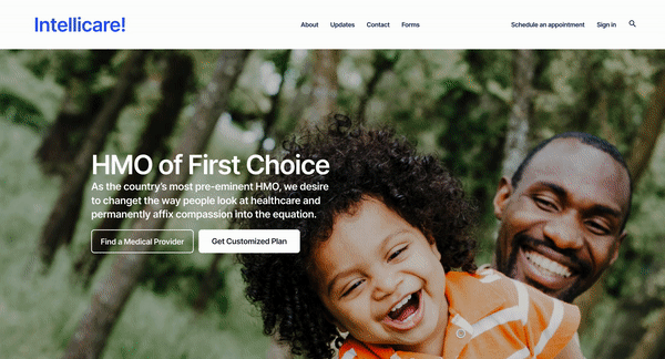
2. Landing Page
Features a better set of headline and subtext about Intellicare and accompanied by two buttons which are the most accessed items by users and potential clients.
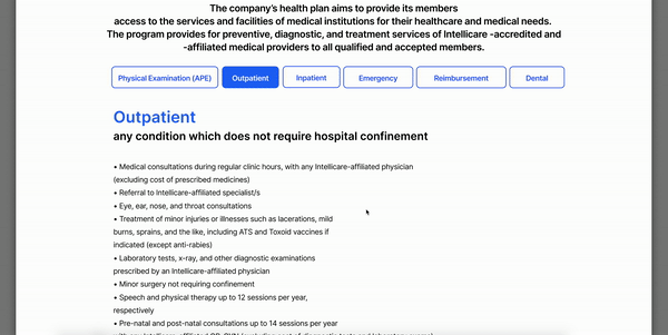
3. Plans & Services
This now features a brief description of the plans and two buttons to encourage potential clients to take action whether to learn more or apply for the service.
4. Mission and Partners
A brief statement about Intellicare's mission and the partnerships that allow them to achieve this mission.
5. Vision & Selling Points
Better choice of photo and a strong hierarchy that allows users to read through their selling points clearly.
6. Impact
These numbers make their case more strong and allows more positive response from users.
7. Form
Now that users and clients have gone through their story, partnerships, and services, they can fill out the form to communicate their interest about the services.
8. Footer
The footer now features quick access to contact customer service and lists all of the items from the navigation bar and privacy/data related inquiries. It also features Intellicare's delights, socials, and link to the App Store to download their app.

Homepage
Brief
Intellicare's current home page contains many information for its users and potential clients which can be overwhelming. A lot of items are condensed into one long home page which doesn't address a lot of user's main needs.
Goals | Design
Goals | Business
The new design aims to simplify the information and the experience and use a more organized hierarchy to communicate the main points that users and clients need access to.
It also encourages the users to explore and find what they're looking for quicker.
Current users will be able to navigate through their benefits and search for medical providers easily which will hopefully make their experience better and add to customer retention. Potential clients will be able to see the programs, offers, and credibility which will garner Intellicare more inquiries.


Problems
Looking for a Medical Provider and viewing clients' benefits
Besides the home page, there are other problems that needed solving to help the users into navigating the site easier.
After an employee onboards in their new companies, they are given the Intellicare healthcare cards. Some of them doesn't know how to access more information about their benefits and is more often in need to find a healthcare provider in their areas.
Employee 1


Persona
Shona is a young, fresh graduate who just landed her first full-time role at a Fintech company. She was given a good salary and benefits package which included Intellicare’s healthcare service.
Her goals
Shona wants to know which possible health issues are included in her plan and how she can access these benefits anytime. She encountered the first site (old design) and had trouble locating her needs. In this new design, we will see if we can help ease Shona’s process into getting to know more about her healthcare benefits.

Current Design


Design Frustrations
The current design is complicated to navigate and unclear. Once the user ends in the steps & forms section, they are sent to a pdf file that contains the guidebook on how to view their benefits and other information about availing that benefit.
Proposed Design

Solutions
Instead of going through a series of unclear steps, users can now access straight from the navigation tab labeled as "benefits" and tap through each category to see its descriptions, eligibility, and steps on how to avail.
Employee 2


Persona
Kaye has been working at her company for a few months now. She's lively and healthy and doesn't get sick that often. However, she's been having toothache for a few weeks now and is worried that she might have some sort of infection or something.
Her goals
Kaye wants to use her benefits to find a Dentist who could look into her problems. She was frustrated about the current design's directory because it was not updated and she's having trouble locating a dentist close to her since she also doesn't drive a car and taxis also take a while to get to a destination due to traffic. She wants to find someone just a few minutes away from her.

Current Design

Design Frustrations
The current design is complicated to navigate and unclear. The directory is not as updated as one would hope and it's hard to navigate through the different healthcare providers in the patient's area.
Proposed Design

Solutions
Intellicare needs a better search feature which will allow users to navigate through different healthcare providers near their areas. It also needs an easier navigation to schedule an appointment or to see important information about the providers.
Tags & Components
In this feature, color-coded tags and other icons are used to organize the information better. Currently, Intellicare have around 20 kinds of specialties that healthcare providers offer. Each of those branch have sub-branches or specific areas of focus.

Demo: Finding a Medical Provider
SCENARIO
Kaye has been dealing with her toothache and is looking for a Dentist near a St. Luke's Hospital which is around her town in Quezon City.


Medical Provider Directory Landing
Kaye picks her location | Quezon City
Kaye picks Dentistry | Specialty
She adds "St. Luke's" closest hospital
She sees all the names of dentist available
She chose a doctor she likes
Appointment Selection Pop-up
Kaye picks a date available on the calendar
Available time slots appears after selection
Book appointment button becomes active
Kaye confirms, Confirmation screen gave her a summary of info to prepare her for her appointment/visit


Additional Pages
About
News and Updates
Current About page
Current Updates Section
This page has random navigation elements which makes it complicated to skim through the information about Intellicare as a company.
The about page shows a more organized version of the current one and simplifies the navigation by showing all the information about Intellicare's story in a long page format.
News & updates have its own space in the navigation bar and the layout shows the category it's in and the primary button that allows users to read more.
Thi section is hard to interact with due to the lack of buttons and clear visual cues. The photo/image selection can also be improved.


Reflections
Re-designing Intellicare's website was a fun and challenging endeavor. It made me realize that there are still some bad UI/UX that exist today and that just by solving problems of navigation, this can really elevate the user experience and help businesses thrive through it.
There are still many areas in the website that needs more attention but I believe that by making the home page and directory experience better, many clients will be able to find what they're looking for quicker and easier.